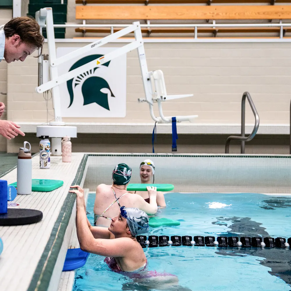
MSU will continue to use the current Spartans head logo, not the proposed one, to build the university’s visual brand identity, Athletics Director Mark Hollis announced Friday.
“After careful consideration, we will use the current Spartan logo design, first used in the late 1970s, to build our visual brand identity,” Hollis said in an open letter to MSU fans. “Using sound branding principles, the university will continue to register some variations of our Spartan logo in order to ensure that this symbol is well protected and firmly associated with Michigan State University.”
Hollis did not return a message left Sunday by The State News seeking comment.
The reassessment came following an outpouring of support for the current logo after the proposed logo was uncovered on the U.S. Patent and Trademark Office Web site.
“I have given careful attention to thoughtful comments received and sought additional counsel regarding how ideas might be incorporated into the overall strategic brand and identity process,” Hollis said. “Our primary objective is to achieve a strong and consistent Spartan brand, but rest assured that, as our mission statement attests, bringing Spartans together is one of our fundamental values.”
Hollis said in the open letter that MSU, not Nike, will “determine the direction we will take.”
“After assuming the athletics director position, one of my initial objectives was to outfit each of our sports teams in a consistent manner and to do so as a component of a unique and cohesive national brand identity program,” Hollis said. “To accomplish this task, we expanded our partnership with Nike so that every one of our 25 teams and nearly 800 student-athletes will all wear Nike-designed uniforms and apparel.”
Hollis said the “identity and branding process” still is on schedule to debut as expected in April.
Many students are happy with the decision to stick with the old logo, and feel Facebook groups and voicing their opinions were factors in the decision.
“I definitely saw that there was a lot of support, especially online with students showing that they wanted the old logo, and that’s what they wanted to see and that’s what they wanted to wear around,” general management junior Meghan Connor said.
Zoology sophomore Beth Pynnonen said the proposed logo was not liked by many.
“I didn’t like the new one at all and most of the people I talked to didn’t like it either,” she said.
“I’m glad they decided to go with what the students wanted, considering we’re the ones who wear it.”
Support student media!
Please consider donating to The State News and help fund the future of journalism.
Discussion
Share and discuss “Current Spartans logo design will remain” on social media.


